Layout customization
azuma mimoto provides layout customization capabilities including
- Multiple layouts
- Customization of colors, images, settings and sizes
- Layout assignment per application
- ...
Layout types and customizations
The following layout types are currently available:
If you need a different layout, please don't hesitate to contact us.
How to: customize a layout and assign to application
- Go to mimoto dashboard and under
Layoutscreate and customize a layout. - Go to the relevant application in mimoto dashboard and assign the created
Layout.
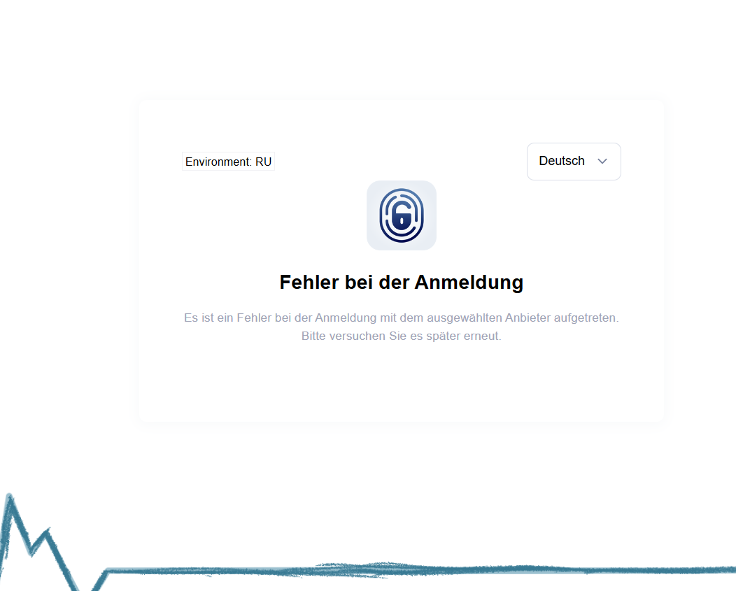
On next login you should see the IDP selection page as well as the Error page in your Layout.
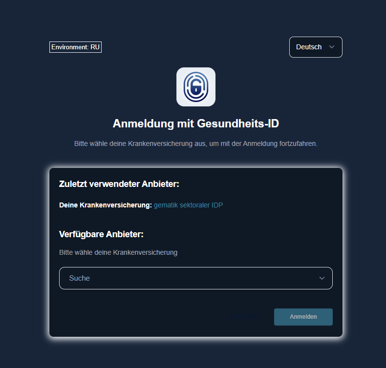
Layout 1
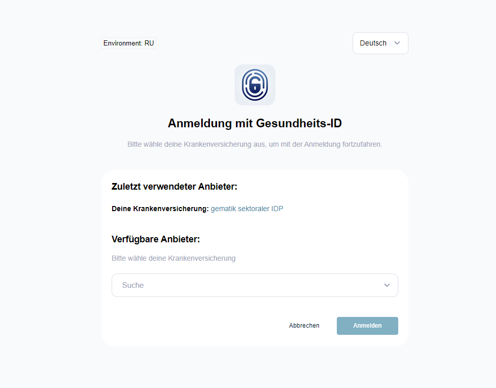
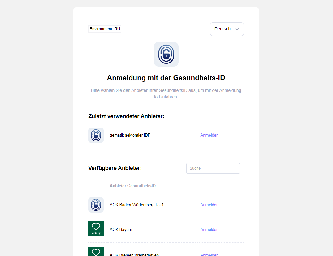
Layout 1 (IDP Selection Page): This is how this layout is displayed with the default parameters
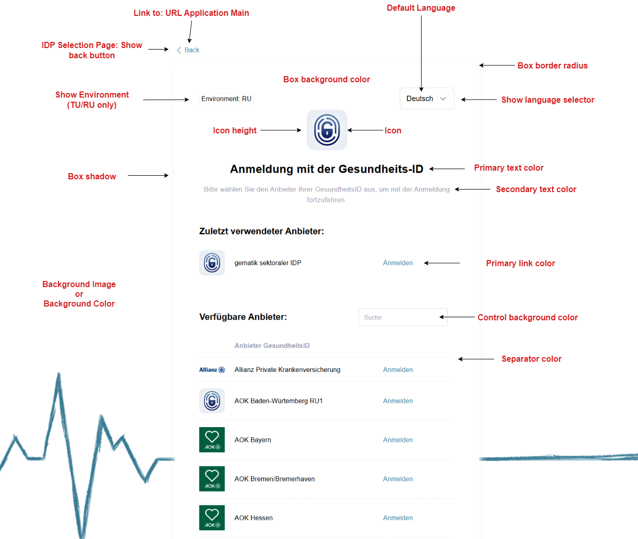
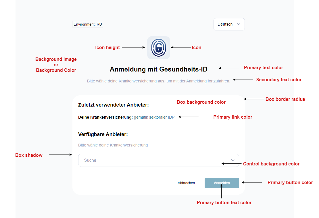
Layout 1 (IDP Selection Page): The following customization options are available for Layout 1
Layout 1 (Error Page): This is how this layout is displayed with the default parameters
Layout 1 (Error Page): The following customization options are available for Layout 1
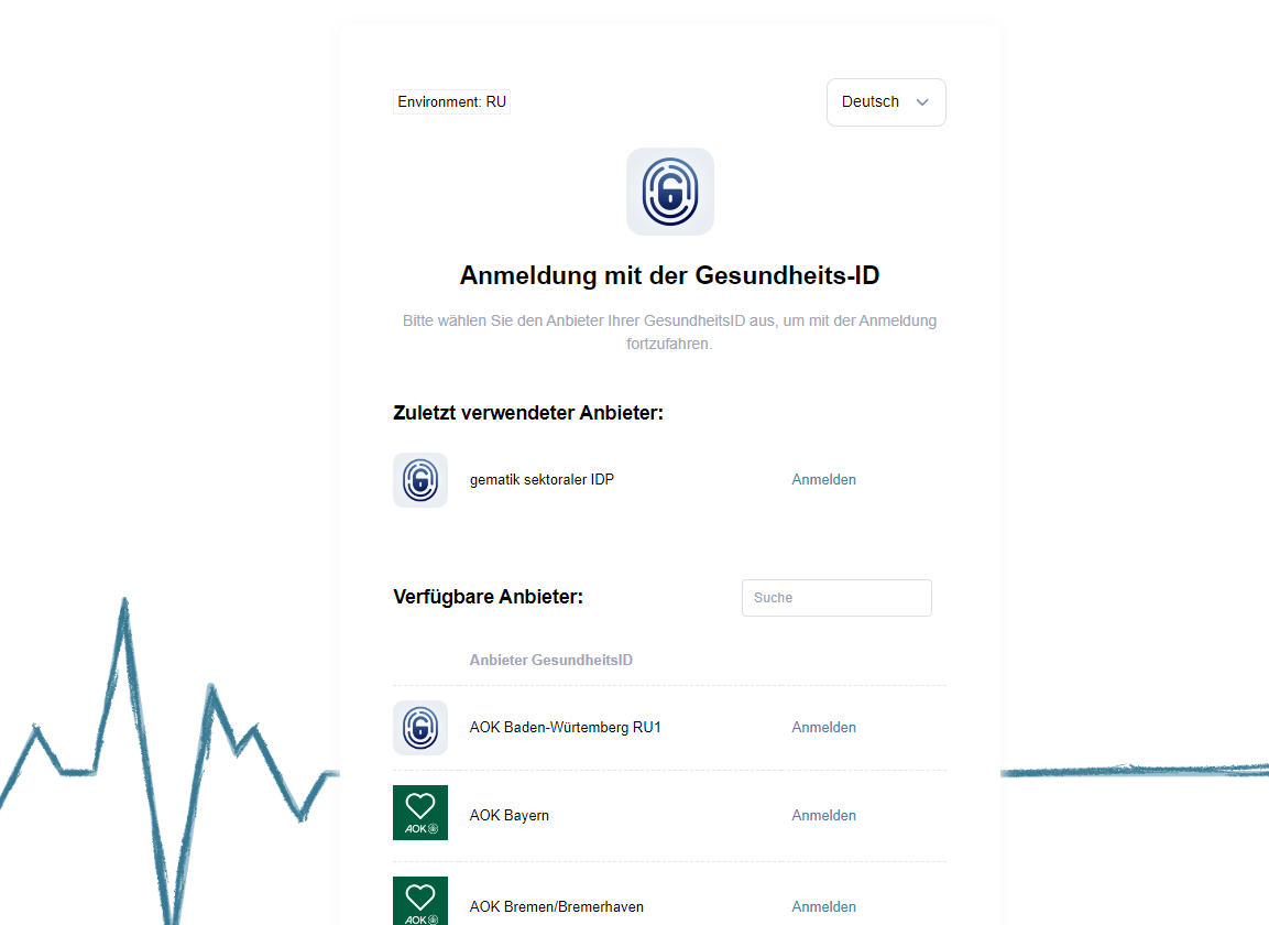
Layout 2
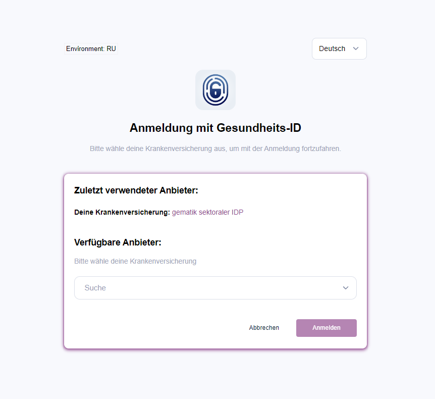
Layout 2 (IDP Selection Page): This is how this layout is displayed with the default parameters
Layout 2 (IDP Selection Page): The following customization options are available for Layout 2
Pre-defined Icons
The following icons are pre-defined and can be used by providing the specified path. Source: gematik
/assets/media/gid_dark_mode.png
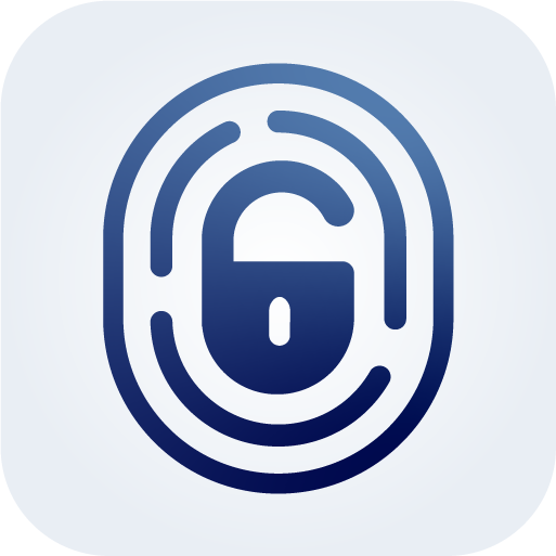
PNG version of the Health-ID dark mode icon
/assets/media/gid_dark_mode.svg
SVG version of the Health-ID dark mode icon
/assets/media/gid_dark_mode_160.png
PNG version of the Health-ID dark mode icon scaled down to reduce size
/assets/media/gid_light_mode.png
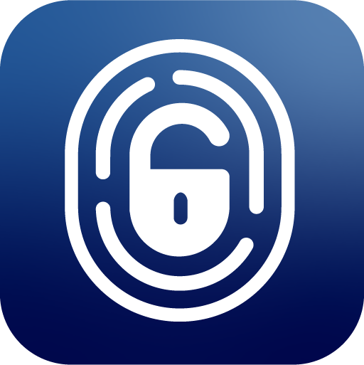
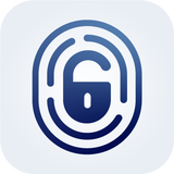
PNG version of the Health-ID light mode icon
/assets/media/gid_light_mode.svg
SVG version of the Health-ID light mode icon
/assets/media/gid_light_mode_160.png
PNG version of the Health-ID light mode icon scaled down to reduce size
Customization examples
Example 1: Box Layout 1
Layout settings:
- Background mode: Color
Layout images:
- Icon: /assets/media/gid_light_mode.png
Layout colors:
- Background color: #f2f2f2
- Box background color: #ffffff
- Control background color: #FFFFFF
- Primary button color: #6f77fe
- Primary button text color: #FFFFFF
- Primary link color: #6f77fe
- Primary progress color: #6f77fe
- Primary text color: #000000
- Secondary text color: #A1A5B7
- Separator color: #E4E6EF
Layout sizes:
- Box border radius: 0.65rem
- Box shadow: 0rem 0rem 0rem 0rem #e7e7e7
- Icon height: 80px
Screenshot:
Example 2: Box Layout 2
Layout settings:
- Background mode: Color
Layout images:
- Icon: /assets/media/gid_light_mode.png
Layout colors:
- Background color: #f8f9fd
- Box background color: #FFFFFF
- Control background color: #FFFFFF
- Primary button color: #8d448b
- Primary button text color: #FFFFFF
- Primary link color: #8d448b
- Primary progress color: #8d448b
- Primary text color: #000000
- Secondary text color: #A1A5B7
Layout sizes:
- Box border radius: 0.7rem
- Box shadow: 0 .1rem 0.5rem 0.1rem #8d448b
- Icon height: 80px
Screenshot:
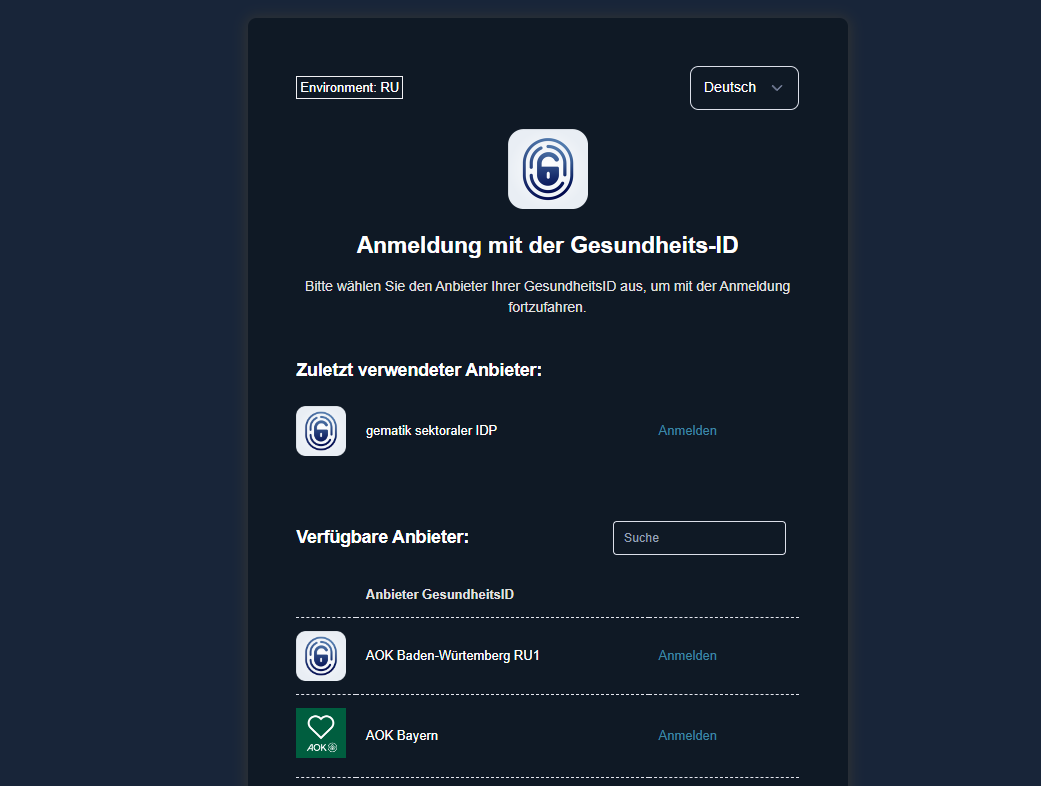
Example 3: Box dark Layout 1
Layout settings:
- Background mode: Color
Layout images:
- Icon: /assets/media/gid_light_mode_160.png
Layout colors:
- Background color: #182539
- Box background color: #0f1925
- Control background color: #0f1925
- Primary button color: #3E86A3
- Primary button text color: #FFFFFF
- Primary link color: #3E86A3
- Primary progress color: #3E86A3
- Primary text color: #ffffff
- Secondary text color: #e2e1e1
- Separator color: #E4E6EF
Layout sizes:
- Box border radius: 0.65rem
- Box shadow: 0 .1rem 1rem .25rem #2f3234
- Icon height: 80px
Screenshot:
Example 4: Box dark Layout 2
Layout settings:
- Background mode: Color
Layout images:
- Icon: /assets/media/gid_light_mode_160.png
Layout colors:
- Background color: #182539
- Box background color: #0f1925
- Control background color: #0f1925
- Primary button color: #3E86A3
- Primary button text color: #FFFFFF
- Primary link color: #3E86A3
- Primary progress color: #3E86A3
- Primary text color: #ffffff
- Secondary text color: #A1A5B7
Layout sizes:
- Box border radius: 0.65rem
- Box shadow: 0 .1rem 1rem .25rem #F9FAFB
- Icon height: 80px
Screenshot: